|
Move Over, Godzilla
Mothra Web Site Revamp
By Jeff van de Pol
A recent overhaul of the UC Davis computing account management
Web site has made for a much improved user experience and includes
several new features designed to provide quicker access to computer
account information for the campus community.
The Monster Transformed
The campus account management system is affectionately nicknamed
"Mothra" in honor of the famous movie monster who was called to
defend her people against Godzilla. In the "B" movie world, Mothra
represents metamorphosis, or renewal, bringing order to the chaos
Godzilla and other villains wreak. The Mothra site is automatically
populated and updated daily using university student and payroll
record systems. It currently supports 42,000 computer accounts,
more than double the 18,000 accounts supported in 1993.
Features
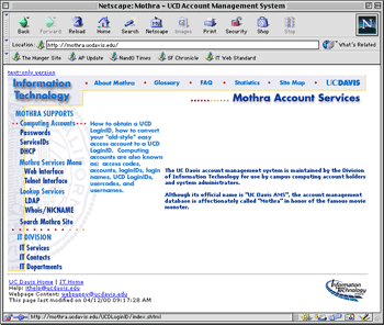
Located at http://mothra.ucdavis.edu/,
the revamped site's new features include a clearer navigation
system, a detailed glossary of commonly used account terms, a
comprehensive site map, and a list of Frequently Asked Questions,
along with revealing statistics on student computer ownership
and the number of active service permits.

Using the Mothra Web site, campus users can establish a new computing
account online, and learn more about the features and services
available with each account. Users also are able to test their
existing UC Davis account login names, passwords, and Web browsers
for proper levels of network security, thereby preventing unauthorized
access to private information. Other useful tools on the Mothra
Web site include links to two online directories, which allow
users to look up colleagues' email addresses and other public
account information by entering the individual's name or mailID.
New Design
As part of a recent push to make IT Web pages more user-friendly
and consistent, the group responsible for managing the Mothra
Web site went a step further and added a host of new features.
First and foremost, the redesign focused on an improved user
experience, according to Diana Foster, a member of the project
team. "Most of the pages were rewritten to be more user-friendly,
and the new navigation system is considerably more intuitive,"
Foster shares. A new service-oriented side menu, located on the
left edge of each page, quickly directs faculty, students and
staff to how-to information and key services. Mouse-overs help
the user get a quick peek at the contents of each menu link. Now
most information is no more than one or two clicks away.
For those working from home or with slower network connections,
a text-only version of the site now allows for quick access. The
inclusion of a glossary, site map and list of Frequently Asked
Questions (FAQ) also provides quick answers to many of the questions
users have about campus computing accounts.
"Having a glossary and FAQ available has finally allowed me
to figure out what the acronyms and ServiceIDs on my account really
mean," says Ward Kadel, a senior Genetics student.
The quicker access to the online directories also appear quite
popular. "Being able to easily check for the email addresses of
my friends is also pretty cool," says Kadel, "and extremely helpful
when I need to contact a professor about a class assignment."
Particularly interesting is a section with campus computing
statistics. Recent offerings include several graphs detailing
the percentage of UC Davis students who own or are planning to
buy computers.
|


